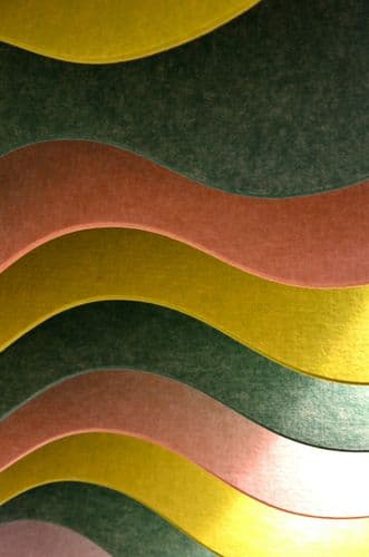
In this third part of the Biodesign Report 2024, our team shifts our focus to the Colour Trends of the Season Fall/Winter 24/25. Before anything else, we believe it is important to acknowledge that trends are often linked to the cycle of consumerism in today's design world, promoting ephemeral styles and frequent change. However, this work aims to create a counter-trend: free, timeless and bold color schemes that celebrate biodesign and biomaterials, encouraging a deeper, more enduring relationship with the matters that we use.
Now, let’s first talk about the Pantone Colour of the Year 2024.
On the Colour of the Year: Pantone 13-1023 Peach Fuzz
Peach Fuzz has been named the colour of the year for 2024. Love it or hate it, this soft, inviting hue reflects a desire for warmth, comfort, and in a bizarre way, connection to the natural world.
Peach Fuzz, in our eyes, is a quiet rebellion against superficial trends. This hue isn’t content to sit pretty by itself; it demands versatility, gracing both the interiors of a chic urban loft and the exteriors of warm afternoon sunlight. The message conveyed is subtle, but the colour can encapsulate the essence of Biodesign with a wink to that exterior warmth.
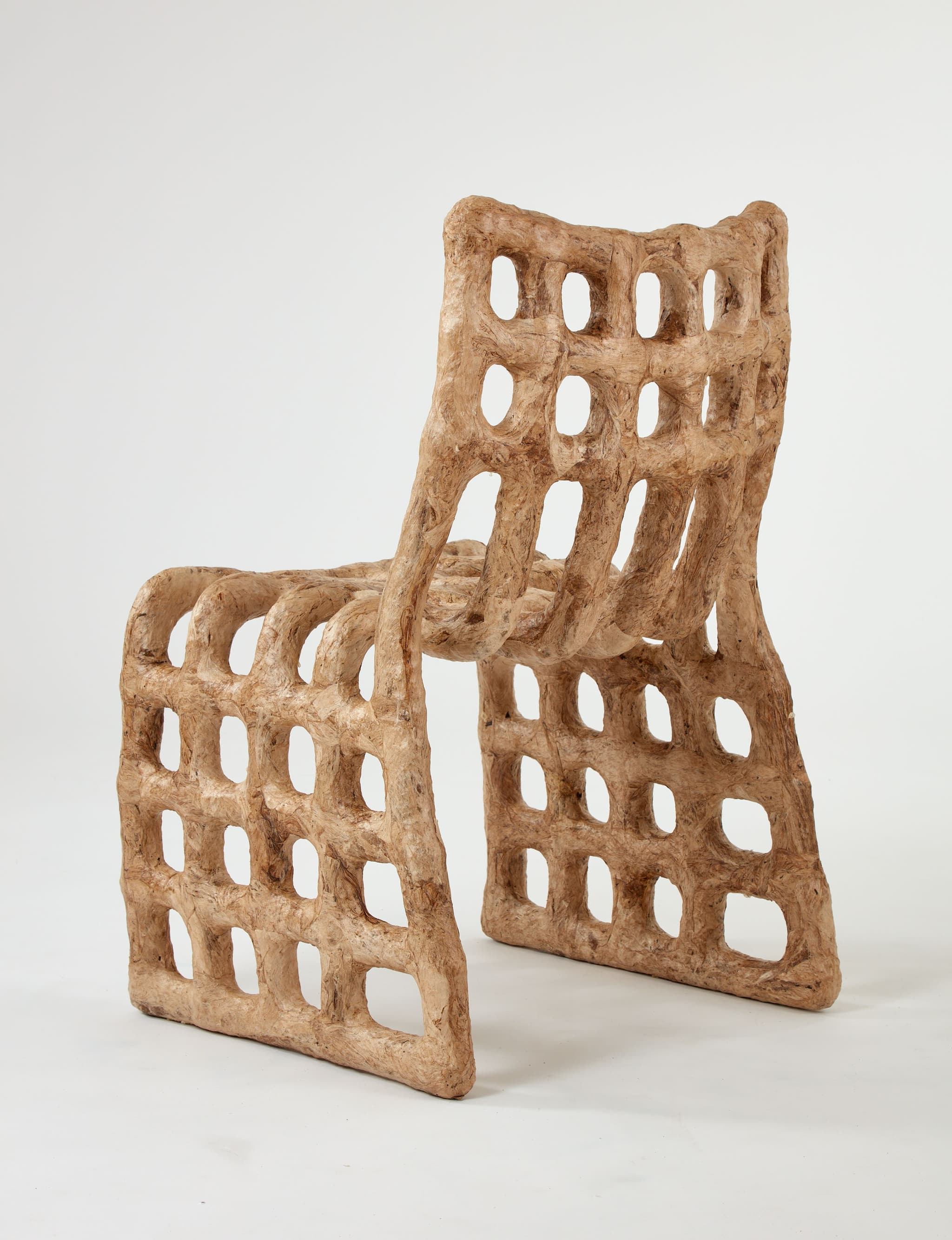
We saw this colour in the work Chair 3, Amate. Artists Samuel Aguirre and Tony Torres blend natural and recycled fibres with the ancient Amate papermaking technique. The result? A chair that makes us turn heads - an eye-pleasing yet intriguing object that would honour the space it is placed in.
Our selection of Colours for Fall/Winter 24/25
1. Chartreuse
- Pantone TCX Bright Chartreuse 14-0445 / 4324 C
- Hex: #c6cf64
- Related Names: Lime, Brilliant Yellow Green
This vibrant green exudes hope and excitement, reminiscent of the bold and fearless contrasts of the glorious 70s. But the history of this colour dates back much further than that. The colour is named after the French liqueur produced by Carthusian monks since 1737, known for its almost-mythical production methodology, its unique herbal qualities and its vibrant green hue. Despite the heritage it carries, the colour in 2024 symbolises a significant change in direction, breaking free from the status quo. It is fresh, crispy and full of hope.
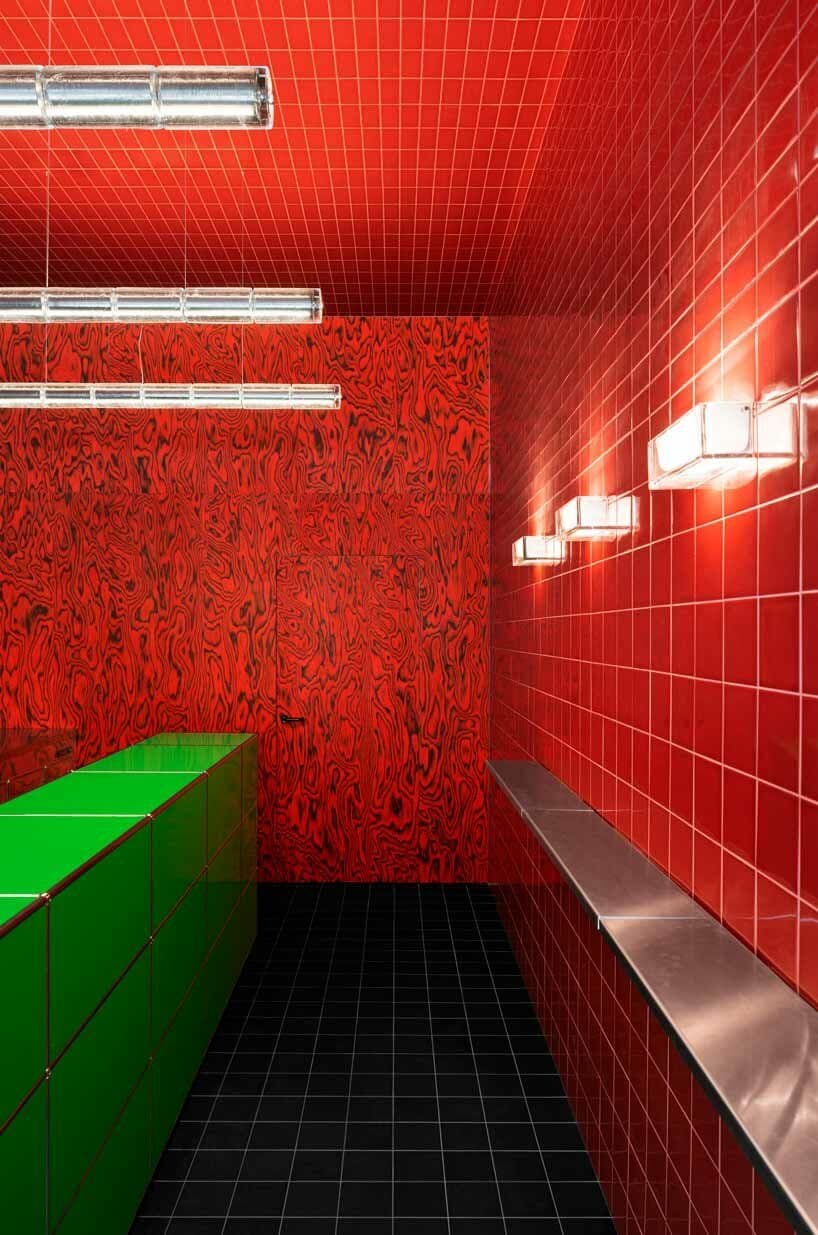
Another notable work we saw was at Spazio Maiocchi, a contemporary art space and cultural hub in the heart of Milan. The space showcased Chartreuse in a bold new context with the unveiling of their bar extension. Designed by Capsule Magazine and architect Paul Cournet, the bar features a striking contrast of glossy red tiles and a vibrant lime green counter. This combination creates an energetic atmosphere that mirrors the lively Milanese cultural scene.
2. Mahogany
- Pantone TCX 19-1724 Cabernet / 4102 C
- Hex: #441c24
- Related Names: Reddish-brown, Bole, Burgundy
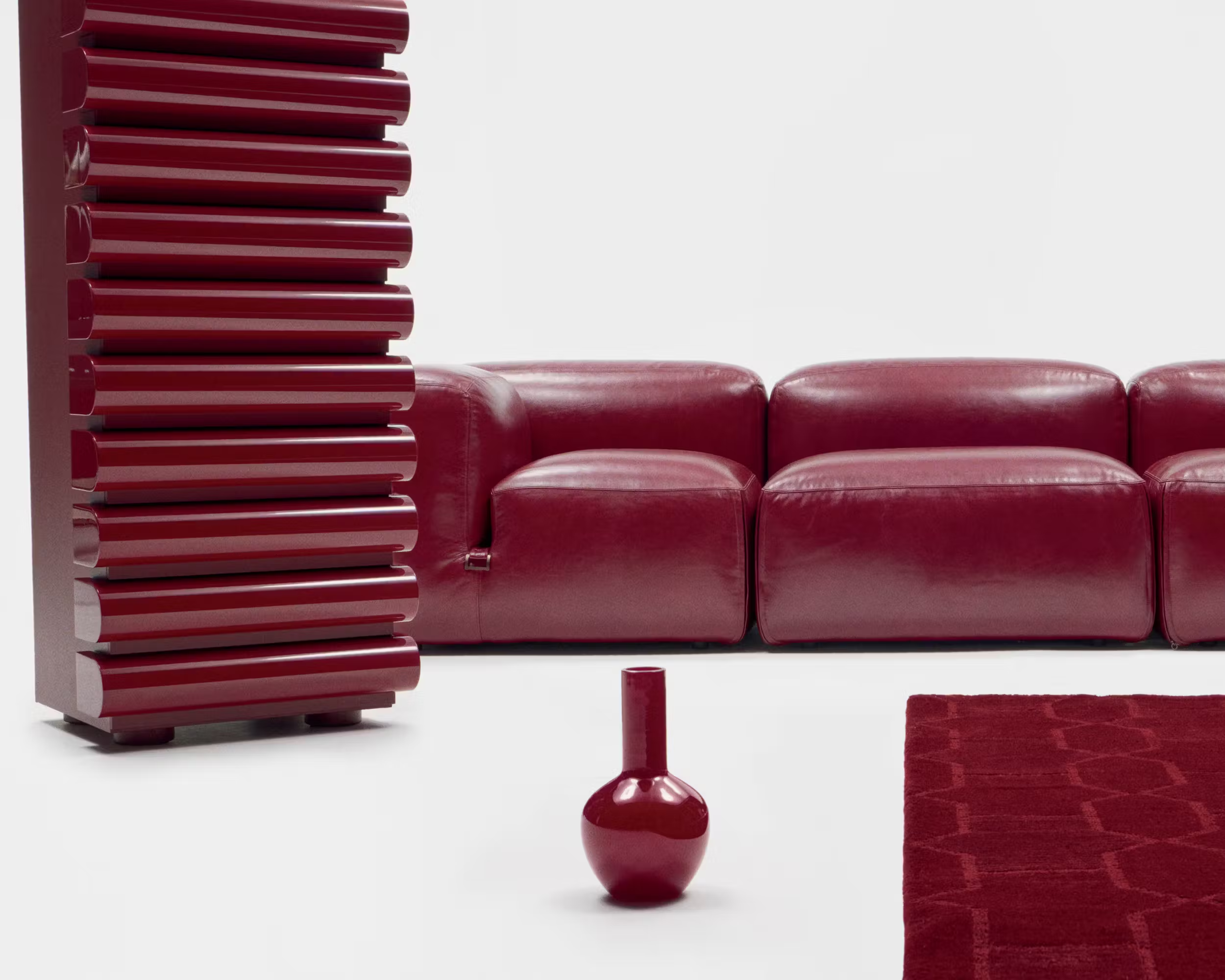
This classical warm tone evokes nostalgia and simplicity. It is classical yet not overly formal, providing a cozy and inviting ambiance. Gucci’s ‘Design Ancora’ exhibition at Milan Design Week 2024 showcased this colour beautifully, reimagining furniture classics in deep red tones. "Ancora," meaning "again" or "still" in Italian, perfectly reflects the brand’s mission to revisit and reimagine the golden age of Italian design.
3. Viridian
- Pantone TCX Ocean Floor 17-5440 / 7717 C
- Hex: #00847a
- Related Names: Teal, Persian Green, Malach
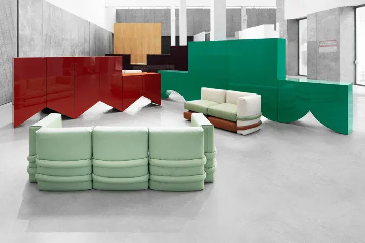
Viridian looks familiar - after all, it is green or blue that we are surrounded by in nature. Yet, this colour is still fresh to the eyes, offering a sense of warm feeling towards the last moments of a winter sunlit afternoon. The Viridian pigment was first prepared in 1838 in Paris by the colour chemist and painter Pannetier, and its unique manufacturing process developed in 1859 made it more accessible.
BD Barcelona’s collaboration with Muller Van Severen exemplified this hue’s versatility at Milan Design Week 2024. Their debut collection of cabinets and sofas featured a stunning array of Viridian shades, merging contemporary design with functional boldness.
4. Butter Yellow
- Pantone TCX Lemon Icing 13-0515 / 7499 C
- Hex: #f6ebc8
- Related Names: Lemon Chiffon, Butter Yellow
Butter Yellow adds a touch of gourmandise for the Fall/Winter season. Its soft, buttery tone also offers a sense of luxury and warmth. LOEWE’s collection of lighting designs at the Milan Design Week 2024 demonstrated the elegance and versatility of this hue, using materials like bamboo, paper, and glass to create innovative and sustainable designs.
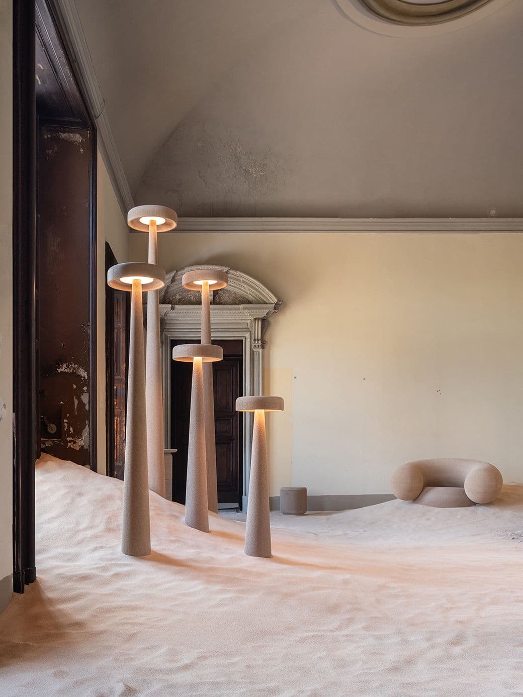
At Milan Design Week 2024, the "Printed Nature" exhibition by Harry Thaler gave a nice revisit of this shade we almost know too well. Using econitWood™, a revolutionary 3D printing material made from wood waste, Thaler's creations are bathed in shades of the warmest, most pleasant cream colour.
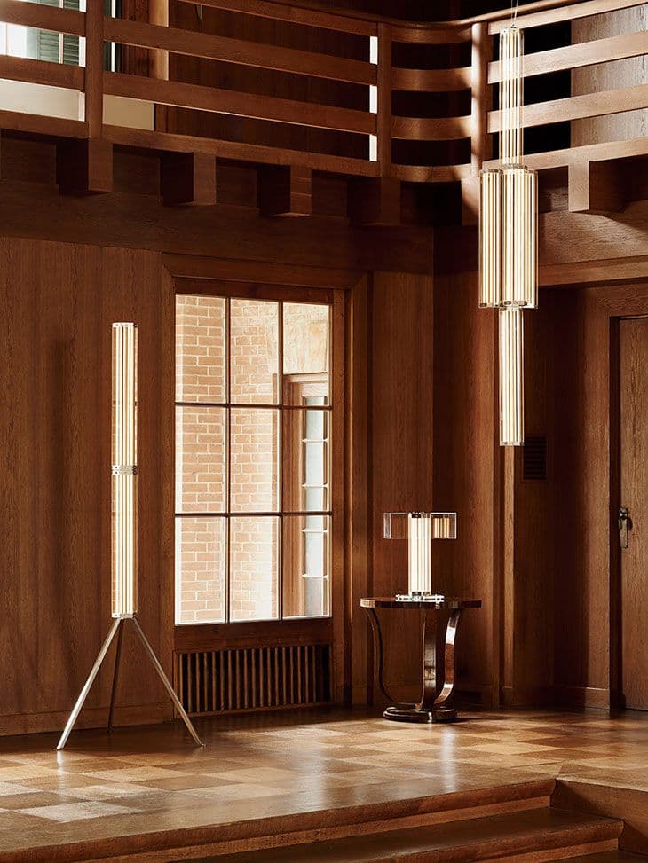
We were also impressed by the "SuperWire" collection, conceived by Formafantasma. This modular lighting system, featuring hexagonal glass panels and slim LED strips encased in borosilicate tubes, showcased the colour Butter Yellow / Cream in a context of modern elegance and technical prowess. Anything else? Flos' commitment to repairability and sustainability, with easily replaceable components, underscores a great shift in the design system.
Conclusion
These colours we chose for the Fall/Winter 24/25 reflect a broader trend towards biomaterials and Biodesign. As we look forward to Paris Design Week in September 2024, we anticipate even more innovative uses of these colours across different design disciplines, while giving a nod to nature, the outside world, and the wonders they bring to our lives.
---
In case you missed this:
Read Biodesign Report 2024 - Part 1: Materials to watch
Read Biodesign Report 2024 - Part 2: New Fabrication Techniques to Watch
Once the 5 parts are all published, our team will compile them into a downloadable PDF.
In case you want to contribute to the report, or you see great biodesign and biomaterials that we absolutely should know about, ping us at contact@tocco.earth


