Key Points
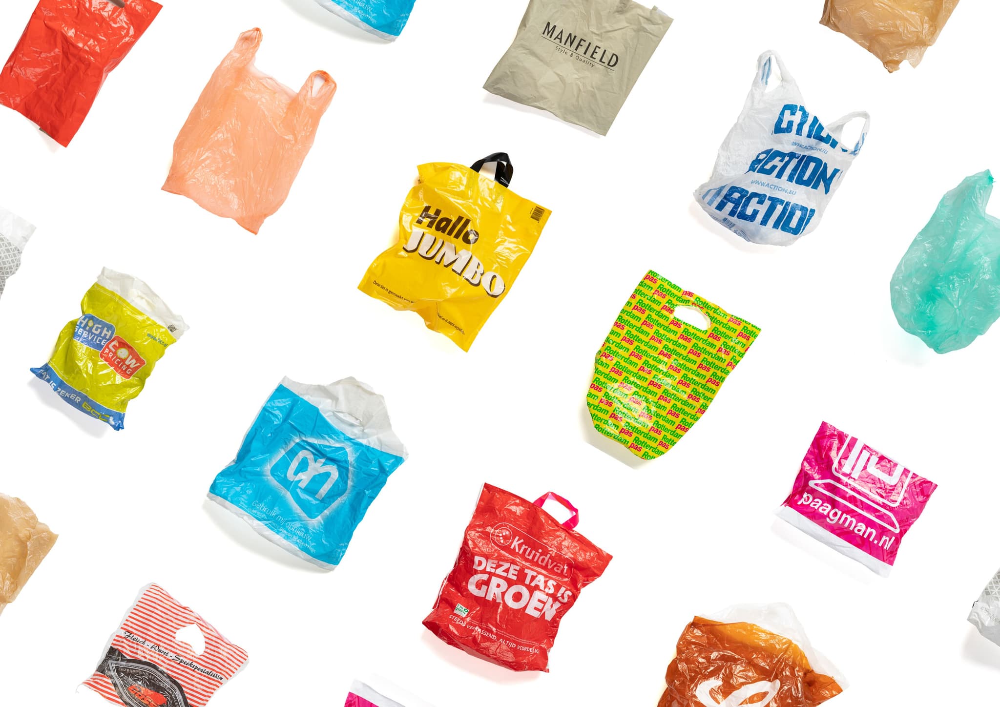
- Treats a single bale of HDPE from SUEZ as a controlled palette, hand-sorting bottles by brand and colour so each logo tint becomes a repeatable design “pigment”
- Surfaces a key industrial bottleneck: colour-sorted recycling needs space and costly optical sorters, so she uses manual sorting as both constraint and creative engine rather than chasing uniformity.
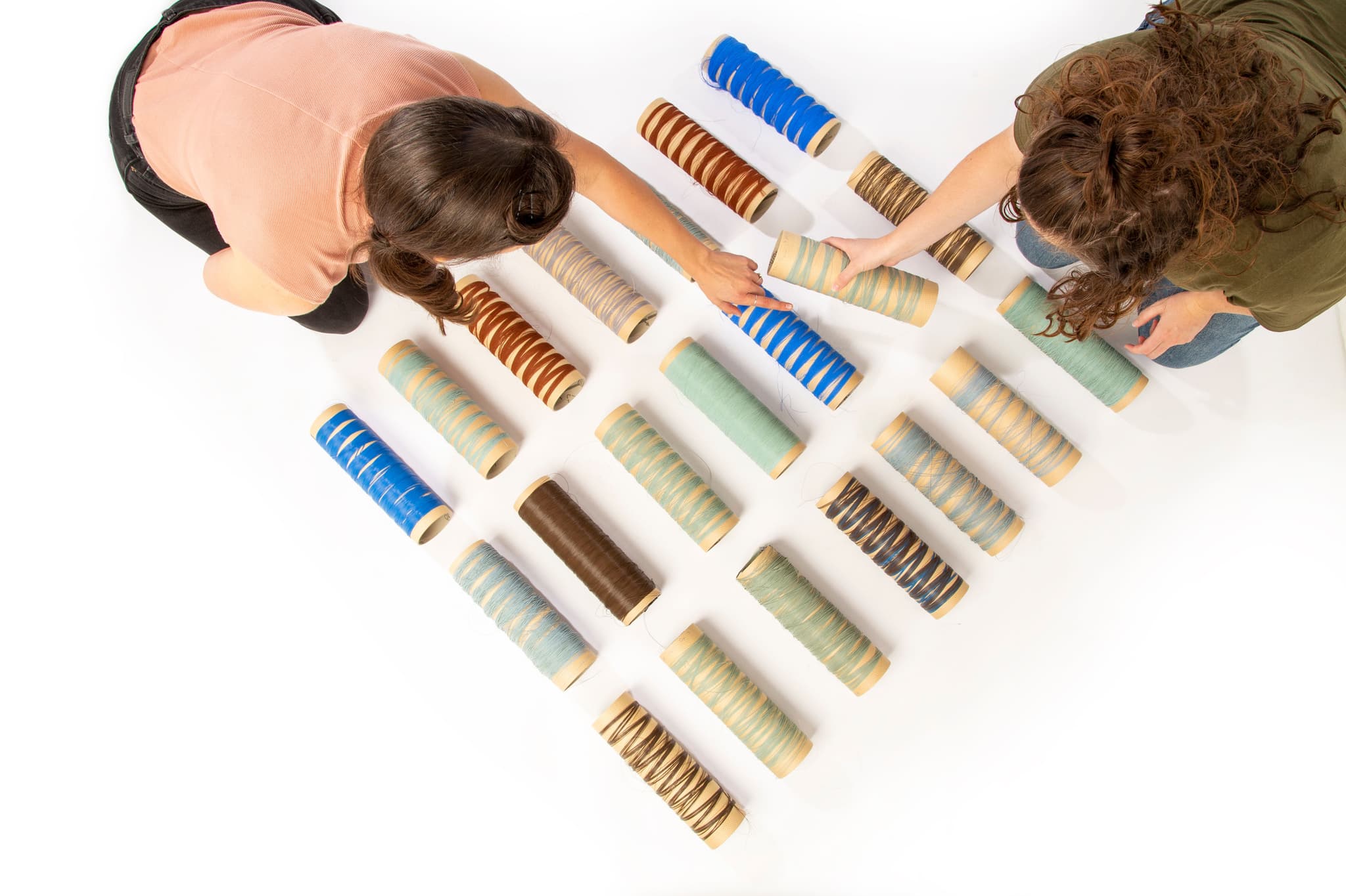
- Finds that HDPE from different brands behaves differently despite sharing the same recycling code, so each batch is tested across shredding, injection, pressing, and film blowing before being matched to specific applications.
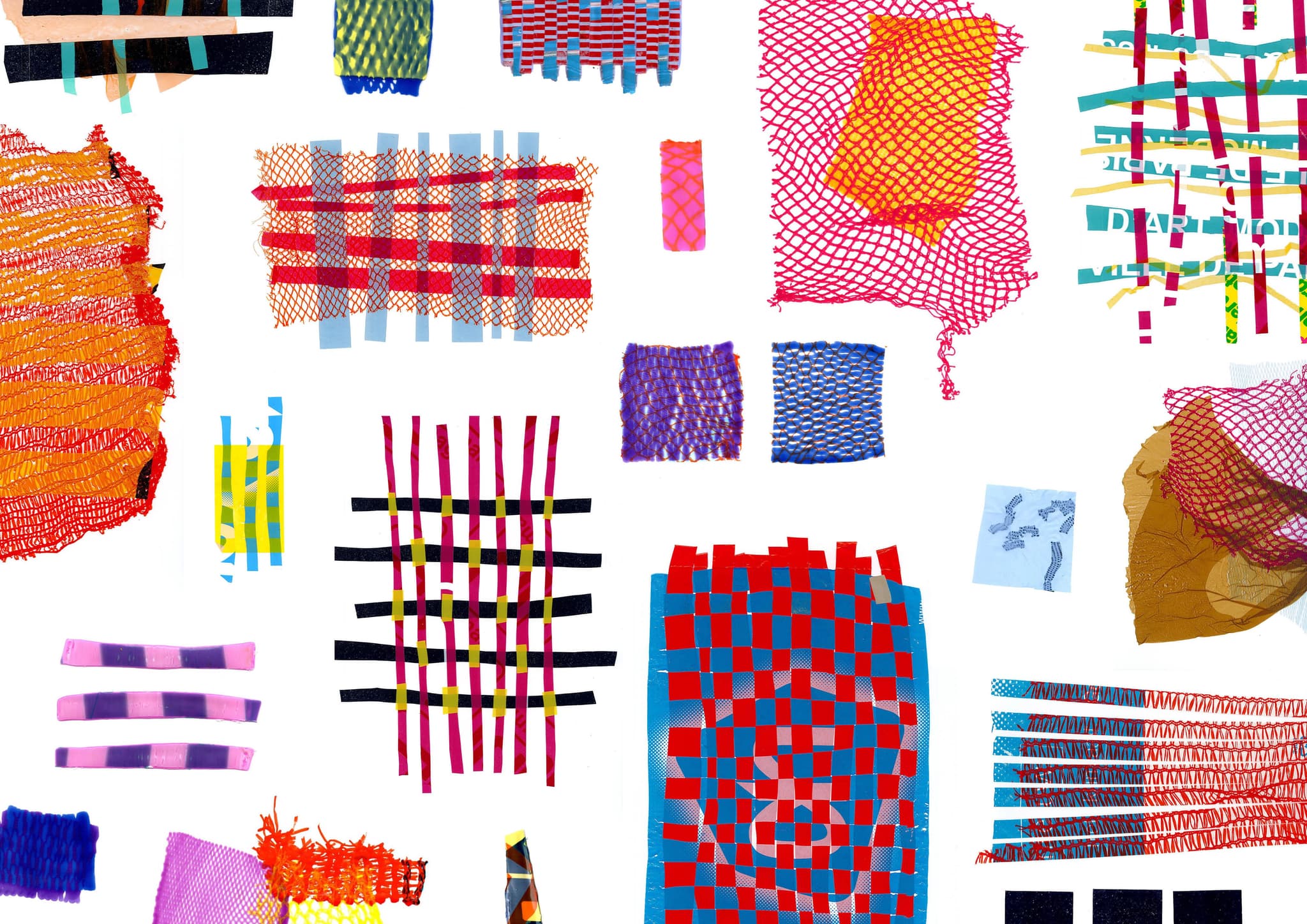
- An unexpected result from laminating multiple blown films created an open, perforated structure; this “error” is now reused deliberately as a visual and structural motif in her samples.
Full interview with Jessica den Hartog
In your Recolored project, you created a library of recycled plastics organised by colour. How did you determine the technical processes needed to preserve and showcase such vivid chromatic variation in a material often perceived as dull?
I received a bale of HDPE plastic from SUEZ, a waste sorting company. I began by sorting bottles by colour and brand, since each brand often uses unique hues. After shredding, I was left with a palette I could freely recycle and design with. This colour-driven process allowed me to shift the perception of plastic, from dull to vibrant.
Sorting plastics by colour is a demanding step. What practical challenges arise when working with waste streams, and how do you refine them into usable, high-quality design materials?
Colour sorting requires significant storage space and precision. While industrial machines can detect and sort flakes by colour, they are prohibitively expensive. As a designer, I see this as both a challenge and an opportunity: colour is what gives plastic its expressive potential. That’s why I sort everything manually, without colour, there’s no design, no composition.
How do you evaluate which production methods, hand-based or machine-based, best suit the properties of a given plastic batch?
Accessing industrial machinery as a designer is difficult: factories operate non-stop, leaving little room for experimentation. Once I found a lab willing to collaborate, I explored every step: shredding, injection molding, pressing, and film blowing. I aimed to give industrial techniques a personal imprint. The goal was to explore the material’s nature, not just produce a final form. This experimentation shaped the foundation of my material library.
Waste plastics are notorious for being composite and unpredictable. How do you address contamination and variability in material streams to achieve consistent outcomes in your work?
You quickly realise that not all plastics behave the same, even if they carry the same recycling symbol. For instance, HDPE from brand X behaves very differently from that of brand Y. As an independent designer, I treat each sample as a unique material: I analyse its behaviour and response to different techniques. That helps me understand which colours and batches are suitable for specific applications.
Your process is highly experimental. Can you share an example where unexpected behaviour of plastic waste opened up a new design possibility you had not initially anticipated?
Almost all my samples came from experimentation, except the colour swatches, which required precision. One of the biggest surprises occurred during film blowing: the machine only allowed a 7 cm surface, but I needed more. By pressing multiple films together, a new open structure emerged from the heat. This unintended effect became a feature, adding a rich compositional and aesthetic dimension to my work.
How do you envision the role of colour-driven recycled plastics in shaping the future identity of materials across design, education, and industry?
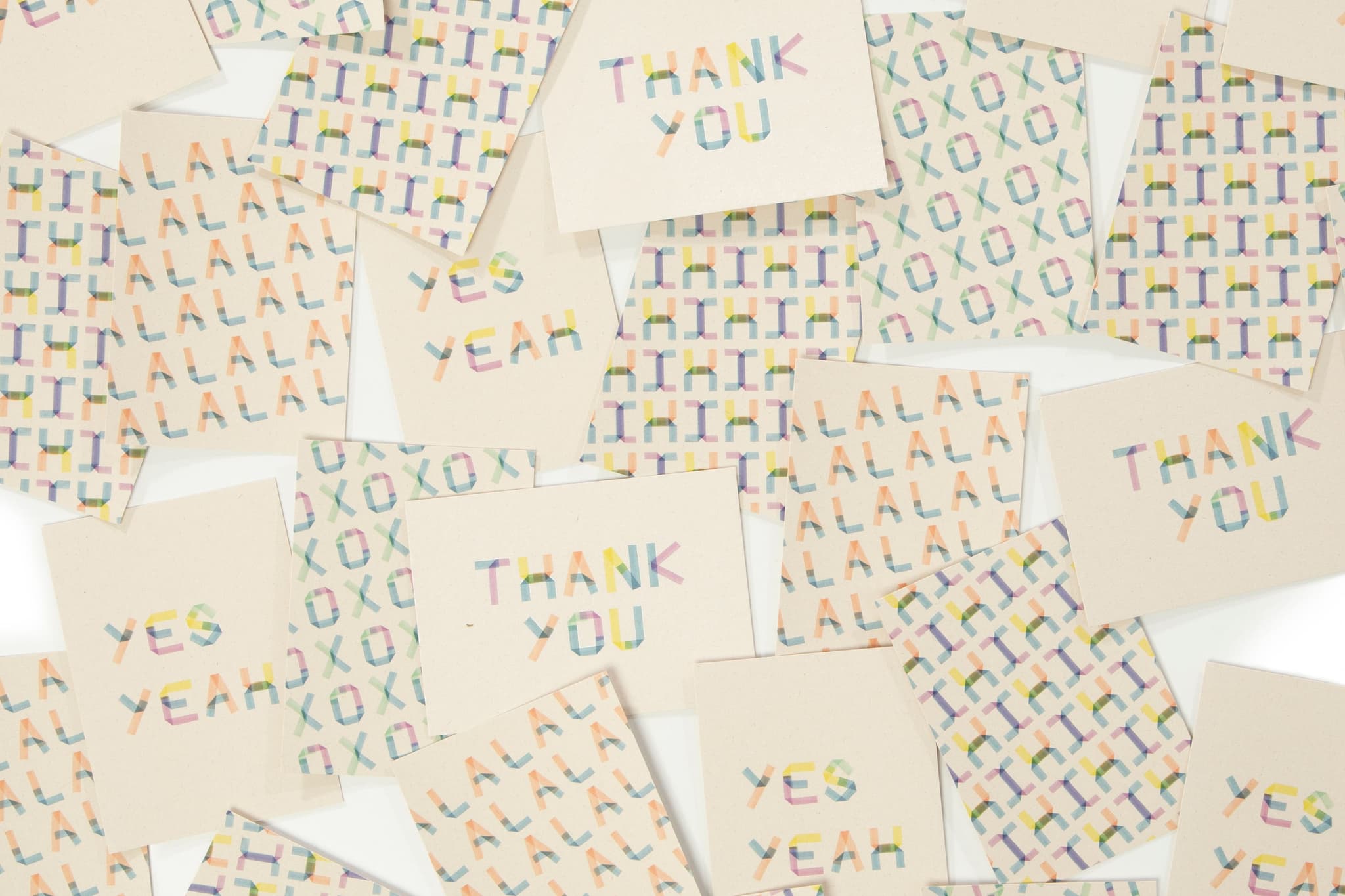
We must stop treating plastic as disposable and start seeing it as durable and expressive. Colour plays a central role in this shift: it proves that recycled plastic doesn’t have to be dull or grey. It opens up new avenues in design and education, showing students and brands that waste materials can be aesthetically compelling. Industry should reconsider the obsession with uniformity: colour variation can add unique identity and storytelling to a product or brand.